
Scotland to explore.
A platform to bring it together.
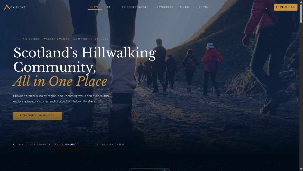
A founder-built outdoor platform combining mountain discovery, interactive mapping, detailed forecasts and community content within one visual identity.
Cairnova is our outdoor business, rather than a commissioned client project. We shaped its website around the needs of people discovering and planning time outdoors in Scotland.
Detailed forecasts.
A clearer way through.
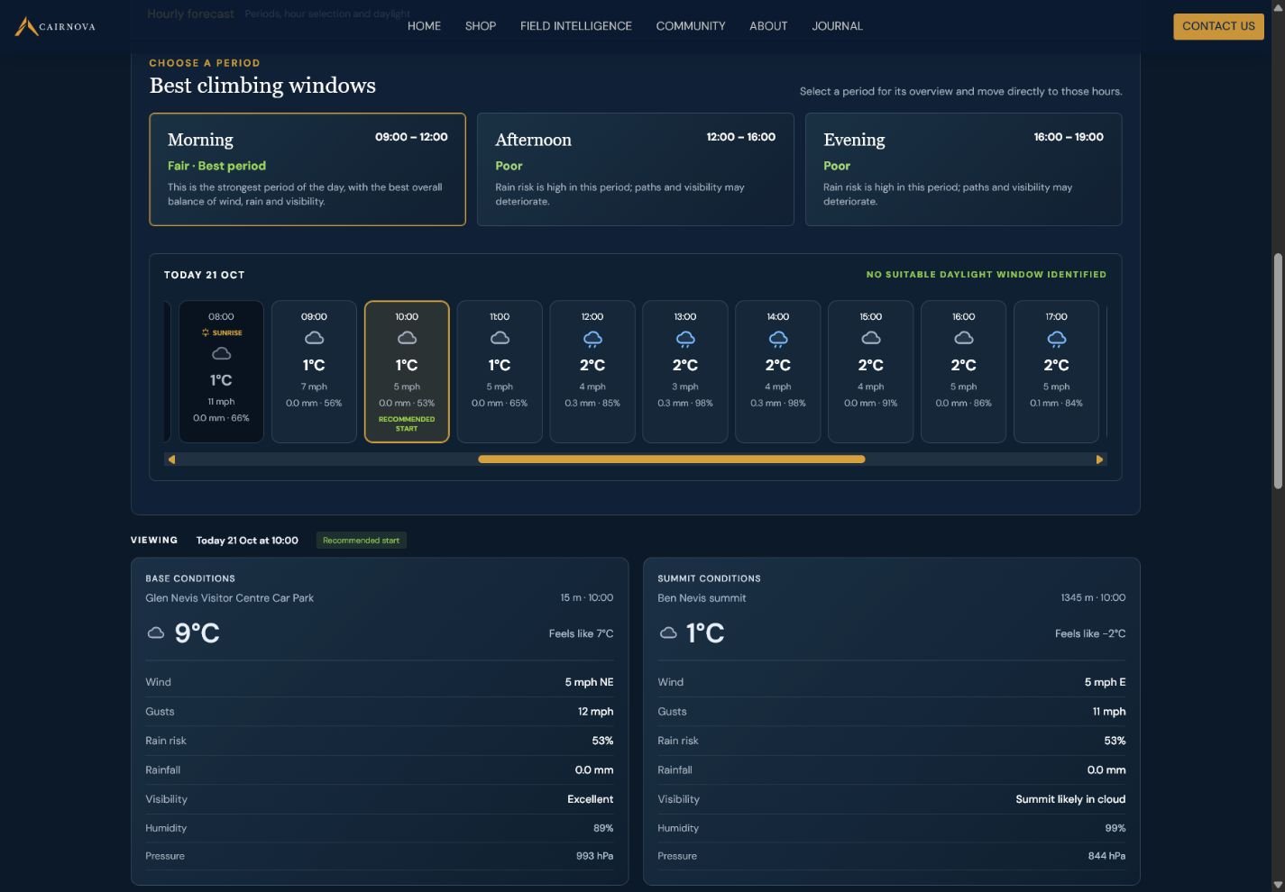
Weather information can quickly become a wall of numbers. Cairnova’s interface separates forecast periods, individual hours and location conditions so visitors can explore the detail in manageable steps.
- Selectable hourly forecast cards
- Base and summit conditions presented side by side
- Consistent labels for wind, rain and visibility
Putting the numbers
in context.
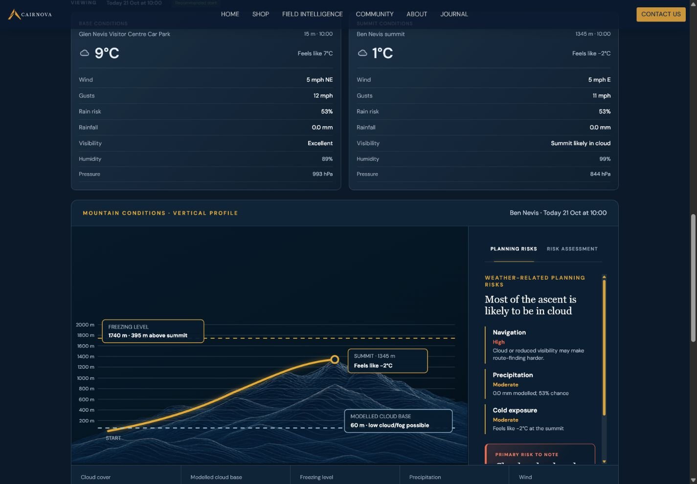
The mountain profile gives forecast information a visual reference, bringing the summit, modelled cloud base and freezing level together in one view.
- Elevation presented through a mountain profile
- Clearly labelled modelled cloud and freezing levels
- Related planning information beside the visual
This demonstrates how we can turn detailed information into a purpose-built interface, with visual hierarchy shaped around the subject.
Beyond these screens, Cairnova brings together satellite 3D mountain exploration, route planning, night-sky tools and community discovery. Explore the live platform to see how the experiences connect.
Explore Cairnova
Product discovery.
With room to explore.
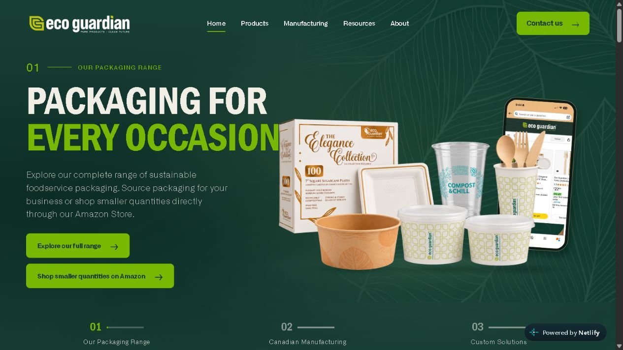
A packaging website demo bringing a broad product range into focus through clear navigation, a searchable catalogue and an interactive 3D packaging studio.
Shown here as a website demo, separate from Eco Guardian’s production website. It demonstrates the design and interactive features, with demo enquiry forms rather than live submissions.
A broad range.
A clearer shortlist.
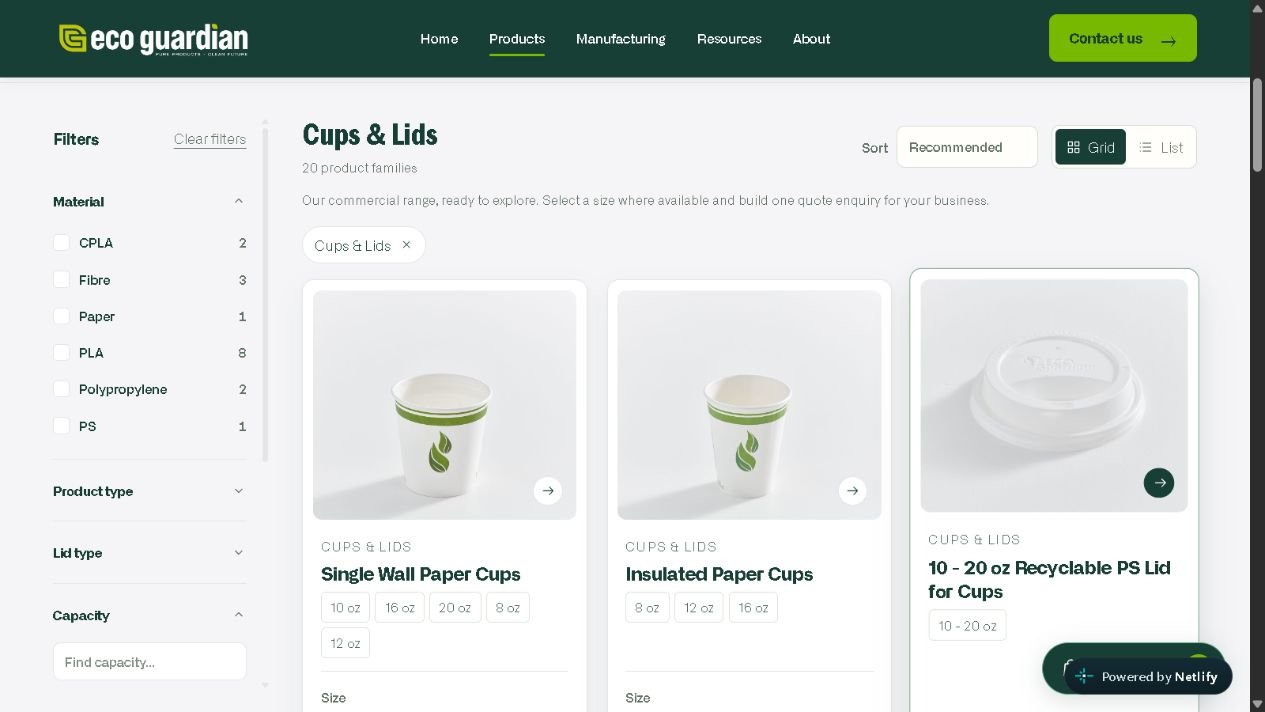
The commercial catalogue gives buyers several ways to narrow their search, combining product categories with relevant filters and consistent product cards.
- Search by product, SKU, size or application
- Category-specific filters and sorting controls
- Size options and a quote basket interface
From an idea
to something you can see.
The packaging studio lets visitors explore a visual concept before making an enquiry. A rotatable 3D preview sits alongside controls for packaging, colour and artwork placement.
- Choose a cup or food-container preview
- Add artwork and adjust its size and position
- Rotate, zoom and download a PNG preview
The preview communicates a design direction; final dimensions, artwork and print specifications remain subject to review.
Try the design studio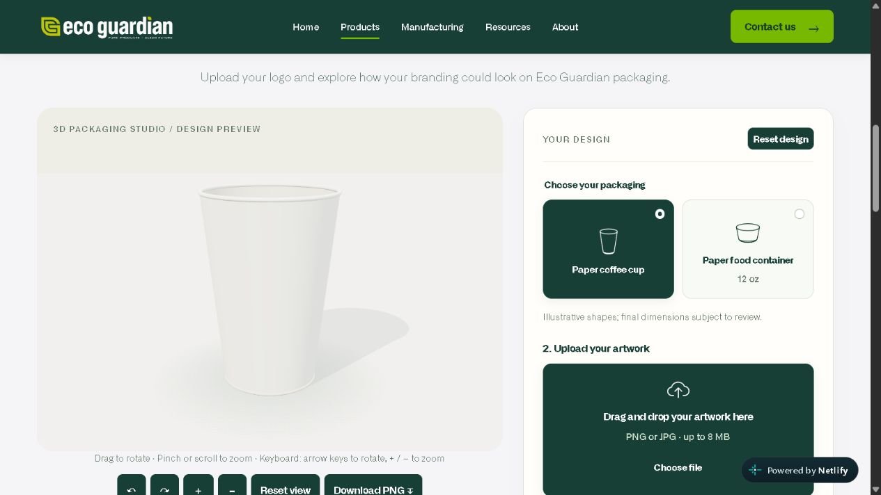
From the first product impression to a more detailed enquiry, the demo connects brand presentation, catalogue browsing and interactive customisation in one experience.
Explore the demo